Levels
December 22, 2020
Timeskip
It seems like an eternity has passed since I last updated my blog, and I’m sheepish that the urge to procrastinate has gotten the better of me. In my defense, I’d been grappling with the basics of game development. In spite of my awareness of the multitude of elements that a game is composed of, I’d been constantly feeling like I was out of my depth. I aspire to become a generalist in this field eventually. And I presumed that I should be proficient in each and every aspect.
However, most of my efforts felt futile, and I turned pensive. Although I still aspire to become a generalist by next year, it occurred to me that it’s nearly impossible to completely master a domain as complex as game development. Instead, I should be capitalizing on the fact that I’m an early-mover to a thriving industry.
It dawned on me that I should be adopting a freelancer’s mindset to tackle this since I’d already turned wary of the tradeoff between time and mastery. I should instead be looking for tools and workflows which can do the heavylifting for me. Then, I should strive for comfort in using the tools. This will ensure that I’m clear with the fundamentals and when the need arises, I’ll be confident enough to double down on the nuances. Subsequently, I could focus on tasks I’m better suited for.
For the next 1.5 months, I will be working with my team on building a VFX film. We aspire to make it as visually appealing as possible. I figured that now would be a good time to put my learnings to the test and I decided to do that by creating a new level from scratch!
During the process, I learnt a lot about creating landscapes, using Quixel, lighting techniques, the Niagara system and sequencer.
Landscapes
Although I’d built an exterior environment before, I felt that it was really amateurish. The hills weren’t realistic and there was barely any erosion or weathering of the soil. The landscape material was picked out from the starter content and there was a severe case of tiling. It didn’t occur to me that I could use foliage to cover up the ground so that it didn’t seem as plain.
I was determined to make this level better than my previous one, so I decided to start by improving on the mistakes I mentioned above.
Heightmaps
Heightmaps are images which contain elevation data. In heightmaps, the black regions indicate areas with low elevation, i.e. valleys, and the white regions indicate areas with high elevations, i.e. peaks.
Before using a heightmap in Unreal Engine, we have to ensure that the image is 16-bit, grayscale and in a PNG/RAW format.
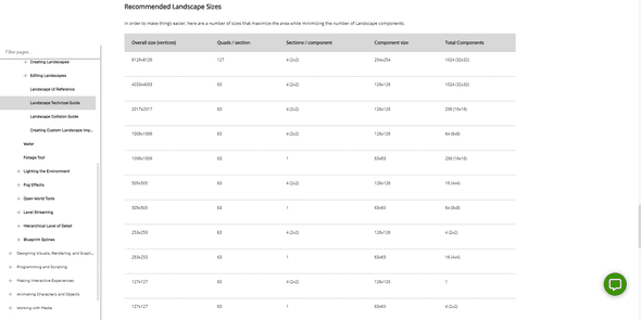
To achieve proper results, we have to check whether the resolution of the heightmap matches the ideal specifications in the Unreal Engine documentation, based on the size of the map.
When we sculpt on the map in Unreal Engine, we are indeed creating a heightmap. However, there are efficient ways to do this. One method is to use a tool called World Creator. Since I was totally unfamiliar with the tool, I looked for a simpler alternative. Fortunately, I stumbled across a useful tutorial by the World of Level Design on YouTube. I felt that it was really informative, so I thought that I could share some of the lessons I learned from it.
Terrain Party is an amazing website which allows you to obtain heightmaps of real-world locations. The following steps help you in achieving accurate results.
- In Terrain Party, set the map view to topographic imagery. This gives you a clearer picture on how the landscape looks.
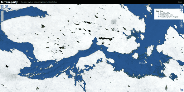
- Once you have picked a region, go to Google Maps.
- Shift to 3D view by using the satellite image. This will help you pinpoint the exact location that you want to use.
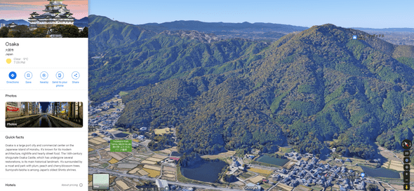
- Once you find the location, go back to Terrain Party. Then, select the exact location by comparing the points in both the maps.
However, this too comes with its own share of problems. The default resolution is not convenient to use in UE and it is hard to sculpt on top of the landscape.
Both of these issues have workarounds which have been specified in the tutorial. The solution that I used was simply changing the resolution of the heightmap so that it’s compatible with Unreal Engine.
Once we plug in the heightmap, we can scale down along the Z-axis to match the player’s proportions.
Quixel Bridge
I wanted to make a level of a valley in a forest. Quixel contains an enormous library of high-quality and realistic assets. So, naturally (pun intended), I began asset-hunting. I downloaded a bunch of assets for rocks, grass and trees.
Placing each one of the rocks individually is a hassle. To do this efficiently, I grouped a bunch of the rocks together. Then, I scaled and rotated them randomly. When they were placed in the hill, it gave an unorderly look which seemed more natural. I also used the foliage tool to add small rocks which are dispersed around the larger rocks to give it a more realistic feel.
I wanted to create an undergrowth, but I didn’t particularly like the result I came up with. Instead, I added patches of tall grass here and there so that they looked like shrubs.
Quixel Mixer
To create detailed landscape materials, my teammate, Harshit, suggested that I should try out Quixel Mixer. Mixer allows you to download textures from Quixel’s library and create unique materials consisting of layers of textures on top of one another.
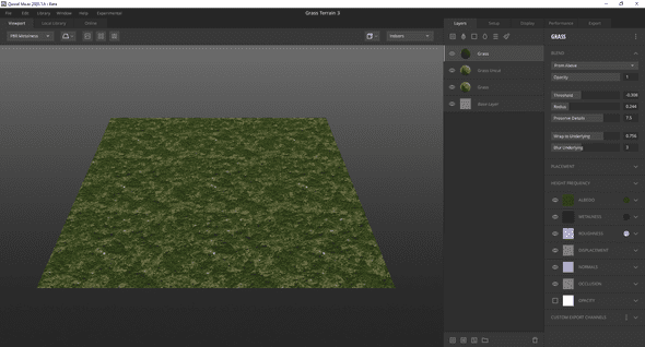 I wanted to create a material with patches of dry grass and traces of mud. So, I created a few layers with varying textures of grass. Then, I played around with their properties so that the bumps were visible. Once I was satisfied with the result, I exported it to Quixel Bridge for further use.
Materials & Tiling
I was appalled that the landscape looked so terrible. There were repeated patterns across the landscape because of the tiling. I looked up why this happened and luckily, I found a solution for it.
In the material node, we create two layer blends: one for the base color, and the other for the normal value. To get the textures, we use the Texture Sample node, which is plugged into the Layer Blend node. We use the albedo map for the base color, and the normal map for the normal value. To change the scale of the material, we use the Landscape Coordinates node and make changes to the Mapping Scale property to reduce the tiling.
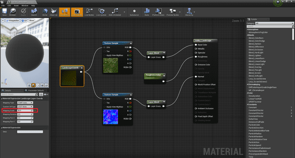 Once the material is applied, go to Paint Mode. Then, click on the layer you want to paint the landscape with and complete the following steps:
- Click on the option Create Layer Info
- Select Weight Blended Layer
- Paint the landscape with the selected layer
If you have multiple layers, repeat the process for each one. Each layer gets added beneath its predecessor. You could choose to make the layer visible on the landscape by selecting it and painting areas with the brush.
Ambience
At this point, I was satisfied with the landscape. So, I decided to set the ambience of the level with the help of the lighting and fog. I played around with the rotation of the Directional Light. Then, I reduced the temperature to give it a darker look which matched the sky’s color. I also tweaked the intensity until I felt that it was good to go.
A cool trick I learned was that changing the Lower Hemisphere Color of the Sky Light changes the color of the indirect lighting. This can help ensure that the color of the shadows cast on the rocks matches the ambience of the entire scene.
Then, I added a volumetric fog to create a misty effect and I tweaked the density, falloff and start distance so that the hills behind the monster appear further away.
I made changes to the auto-exposure in the post process volume so that the lighting doesn’t change depending on the camera’s position.
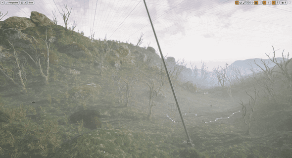 Most of the tricks I tried out in this scene were from a tutorial I watched. Here’s the link if you’re interested.
Niagara System
I’m not really familiar with the Niagara particle system, so I followed a quick 6 minute tutorial, but used the glass material from the starter content instead. I liked the effect so I didn’t bother creating a translucent material.
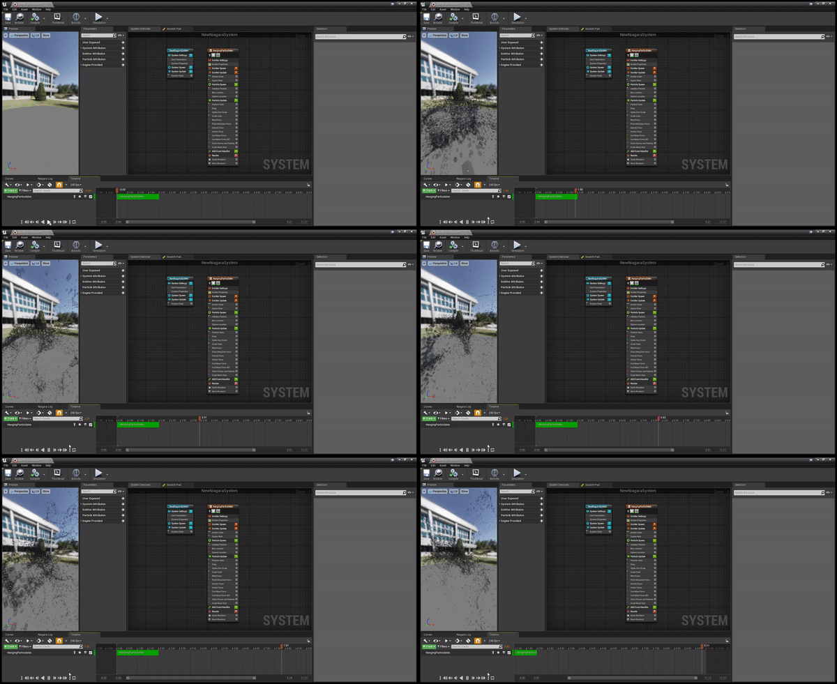 One thing I found really intriguing is that we’re able to set rules which every particle in the system must obey.
Sequencer
Now, it was finally time to build the scene. Cutscenes in Unreal Engine are made using the sequencer, which is really intuitive if you have experience with Premier Pro.
You place a camera and use tools such as the rail and crane (which are parented to the camera) to take shots. For each shot I took, I created a level sequence and added them in a separate folder. In each sequence, we have actors placed such as the characters, particle effects, camera, rail and crane. We can track the properties of every actor placed in the sequence so that we get the desired effect. We can manipulate the properties at each frame. I figured that I could share the ones I frequently tracked here.
- the position of the camera on the rail
- focal length of camera
- aperture
- manual focus distance
- yaw, pitch and length of crane
- animations, location and scale of character
- visibility
A cool trick I learned was that you can make the camera movement in a shot smoother (or linear) by selecting all the required tracked properties and pressing 4 on your keyboard.
Once I was done with all the shots, I created a master sequence and rendered it.
Finishing Touches
To make the clip engaging, I decided to add some background music and sound effects using Premier Pro. My teammate, Keshav, helped me with the editing and guided me so that I could get familiarized with the tool. It seemed pretty intuitive since I already had experience with the sequencer.
Concluding Thoughts
While I do feel like I’ve made tremendous progress since my first landscape, I still think that there are a few things I could work on.
- I could have used the grass foliage to create an undergrowth. That would have drastically improved the quality and realism of the scene.
- I want to learn more about how realistic landscape materials are made.
- I could have added better animation transitions for the character. One instance of this is when the alien begins to run. For a brief moment, the character seems to be running on the spot.
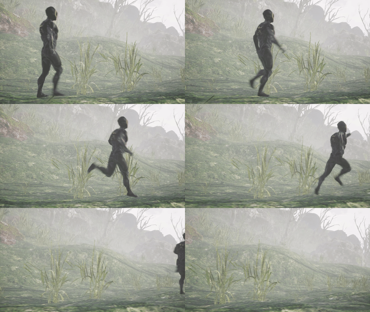
- I’m looking for ways to create high-quality landscapes swiftly. I’ve heard that the Brushify packs on the marketplace are really useful, so I’m doing a bit of research before I consider making a purchase. However, I think that this tool will be extremely helpful for a person like me, who will gravitate towards writing code.
- I should make it a point to hunt for assets on the Epic Store Marketplace. There are plenty of AAA assets available for free that could make the scene look a lot better if I explored well enough.
In a nutshell, I’m delighted that I’m making progress. This has encouraged me to continue persisting as I finally feel that I’m on the right path! I’m going to be working on some really interesting stuff and I’ll make sure that I share it with you here. So, until next time!
